

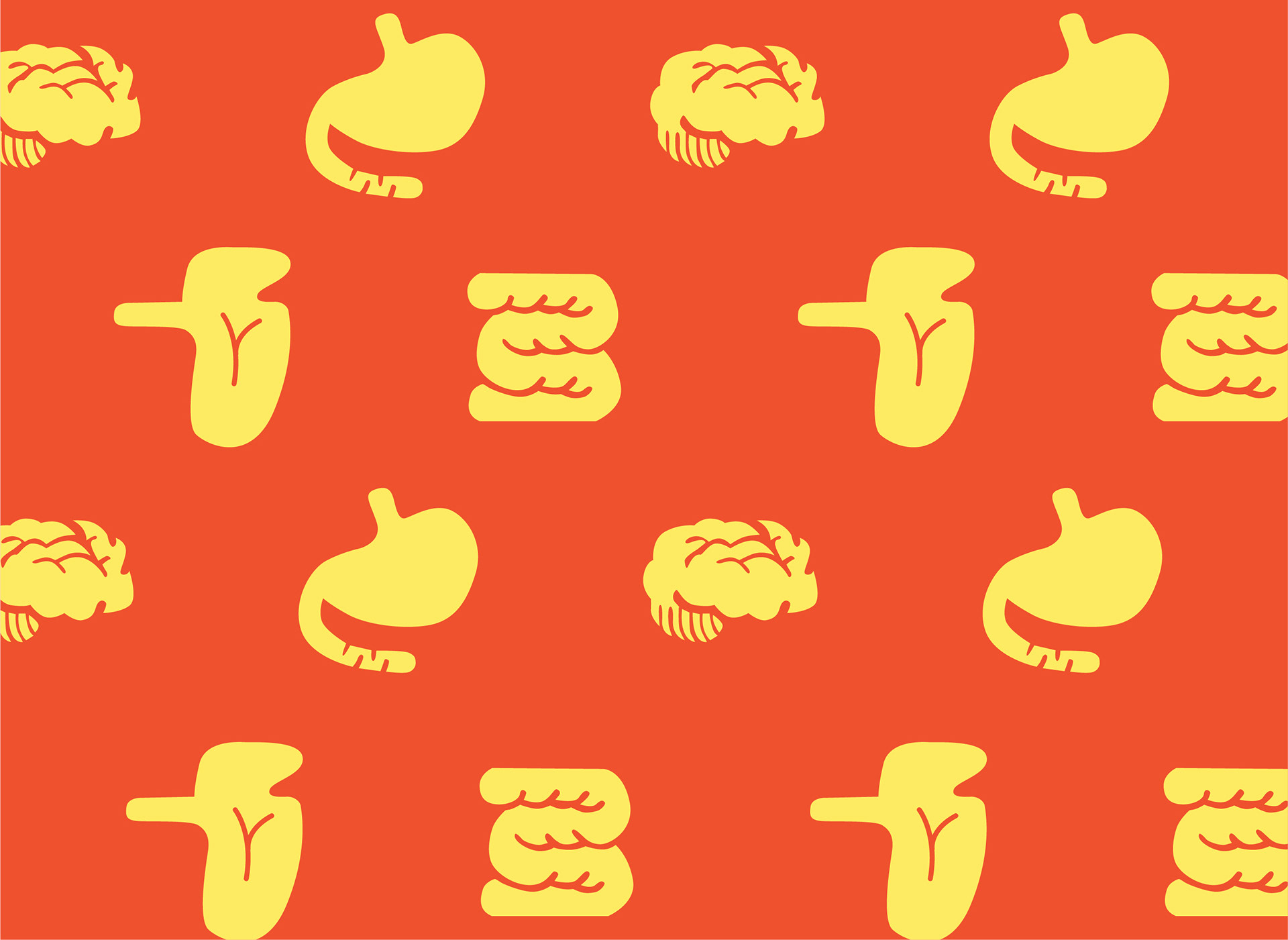
Feel Fit! is the joyful medical toy company, most of the products are board game that the kids and parents can play together. The logo design came with the heart-shape to support the brand vision 'Heart is the most important part of us'. Using the curve to make it look companion for the kids. Also the 2 colours red and yellow that support the brand personality and character, the red represent amusement, warm, energetic, jolly and the yellow represent freshness, knowledge and creativity.


Feel Fit! make it easier to communicate with your children about their own body, to make the fun learning together, to go with the logo all graphic elements have created from the same curve and make the guts look friendly.